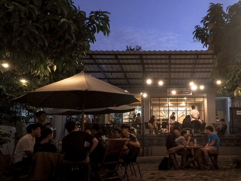
When it comes to coffeehouses, the usual approach is to go for a glamorous facade—something eye catching, something that stands out. But on this site, tucked into a kebon jambu (Betawi terms for rose-apple orchad), that kind of statement didn’t feel quite right. Instead of competing with the landscape, the idea was to strip the building back, make it disappear. The orchard itself is what deserved to be framed—to be the statement.

The Hollow Facade is shaped by two key spatial factors: making the most of an existing kebon jambu below, and—placing the building within the tightly packed shop-house culture of its surroundings. It sits at the edge of Jakarta, where dense urban structures leave little room for nature. So, rather than just adding another building to the mix, this one acts as a threshold—bridging the contrast between the shop houses above and the rare greenery below.
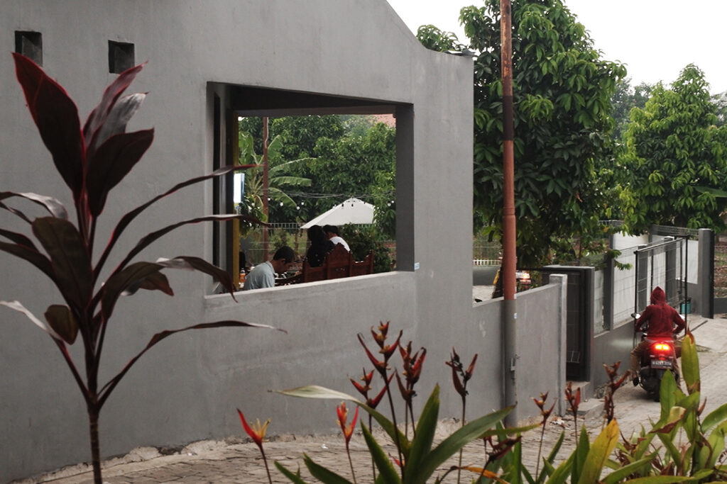
The building plays with this in between quality through a series of framing sequences. From the main road, there’s no grand facade—just a slanted wall pointing straight at the kebon jambu, painted grey. That’s not just any grey, either—it’s the same colour usually used for the ‘arse’ of building in Java, blending the structure into the background like it’s meant to go unnoticed. And that’s true—people there use ‘arse’ instead of ‘back.’ Anyway, for anyone passing by, it attracts as a peculiar invitation, isn’t it? a simple rectangular cut into the wall, giving a glimpse of the greenery beyond.


‘“Less” architecture is used to good effect here. A coffeehouse should be a place for relaxation & heightened awareness. This one quietly succeeds.’ —Steven Dornbusch, on The Hollow Facade first launching’s commentaries
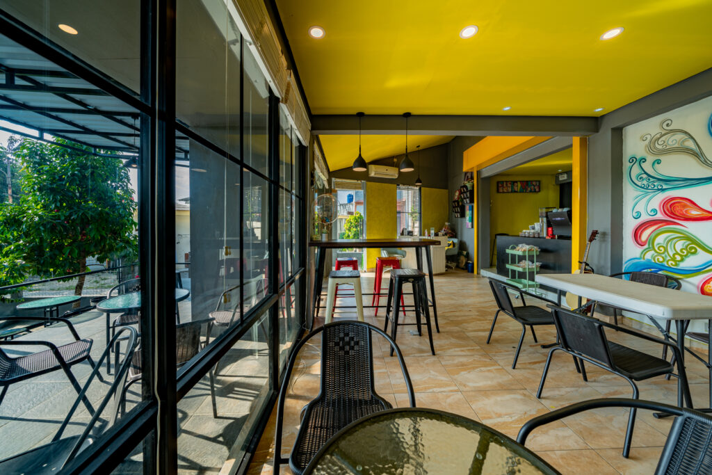
Step inside, and the space shifts again. The room is divided by the way the ceiling plays with height. The bar area is kept high, open—stopping it from feeling too cramped—while the seating area dips lower, making it feel more intimate. But it doesn’t close you in—instead, the lower ceiling is balanced by big windows, all drawing the eye back to the kebon jambu outside. Even the mural and furniture were chosen with local tastes in mind, keeping things familiar, making it feel like it belongs.
The supporting walls guides the spatial grid, a quiet nod to the golden era of modernism—its purpose is to frame the spectators; giving them the sense of boundary, shaping their experience depending on where they sit. The yellow accent follows a similar approach, creating a subtle sense of displacement between outside and inside, yet still holding it all together through floor to ceiling openings.


Project Credits
(2020)
Architects: MADs+Partner—Alhamdamar Mudafiq, design principal; Bangkit Mandela, Ramzani Naswan, design team.
Photographers: Abednego Febri, Bayu Indra K
Writers: Bangkit Mandela, Alhamdamar Mudafiq

